This month we explored the hows and the whys of Michelangelo’s masculine women. We know that he used male models as many Renaissance artists did. It’s likely that his masculine representations of women was intentional. But when you alter the represented gender of your model, how much does it unintentionally affect your art?
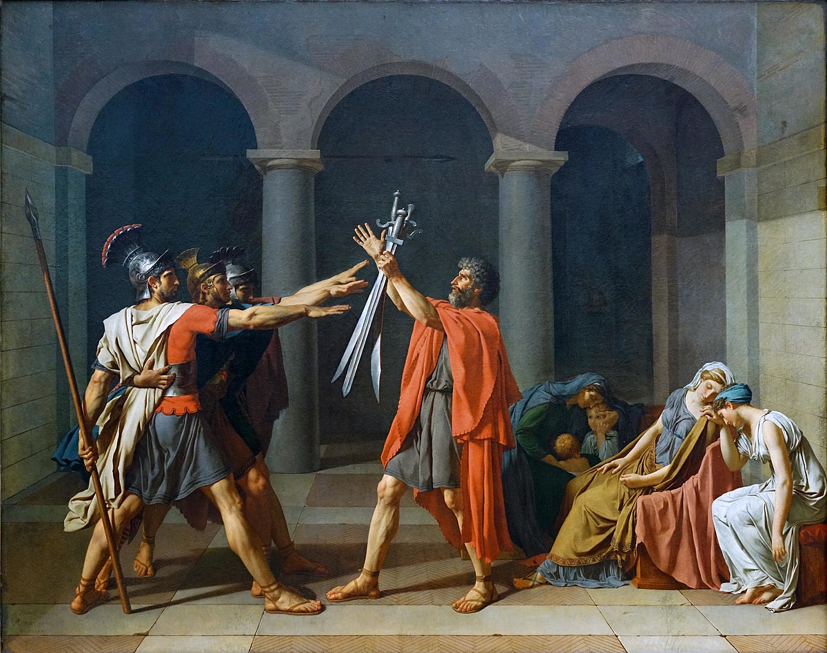
When we represent male or female, it’s not just about anatomy. The female form may be depicted in softer, more submissive poses. In contrast, the male form may be depicted in angular, rigid poses. Strength is traditionally male and emotion is traditionally female. One of the best illustrations of this point is Jacques-Louis David’s painting, Oath of the Horatii.
Oath of the Horatii, Jacques-Louis David, 1784
To the left we see the men about to go to war. They are standing at attention, arms outstretched as they reach for their swords before battle. Their limbs are straights, creating sharp angles; they mimic the sharpness and rigidity of their swords.
To the right we see their wives, faint from the emotions of saying good-bye and perhaps never seeing their husbands again. Their postures are slumped, given to the difficult moment. The drapery accentuates the curves and softness of their forms.
To further explore this concept, I drew six figure studies. The first set was from a male model – a male, a female, and an androgynous sketch. The second set was the same from a female model.
The Male Model

The first sketch was as expected. It was a male model and a male sketch.

In the second sketch, I found that the shoulders and waist were broader than I meant them to be and that the legs seems too thick. I kept making adjustments – making the legs longer, bringing the waist in, adding curves. Part of me wanted to fight it – why does she have to look traditionally female. Why was I softening muscles, making her look weaker? Did she have to be that thin to still look feminine? Perhaps the most telling part of this – I only had questions like this when drawing this sketch. In the end I wanted to give her more muscles and make her look stronger than the male sketch, but still feminine. As I write this I’m asking myself – Why didn’t I do that??

The third sketch was the easiest, but also probably the laziest. I simply drew something in between the first two. Looking back, that wasn’t the best approach. If I wanted to turn this sketch into something more, it would lack substance. There’s no strength, no emotion – it’s just there. Rather than blend the masculine and the feminine into something beautiful, I gave the figure nothing. It’s not suppose to be about the absence of masculine and feminine. Rather the lines that define gender should be blurred and their characteristics used to bring more to the figure.
The Female Model

Maybe in my subconscious my feelings about the previous sketches came out in this one. I think the feminine sketch of the female model looks less feminine than the feminine sketch of the male model. I also like this one better.

The male version is definitely softer here than the male from the previous pose. At first I thought it was the pose, but it isn’t. This figure has less defined muscles.

The first question that came up with this sketch was should they be wearing a shirt. The only reason the chest is covered at all is because I was streaming when I drew these. If I had done these on my own, I would have left the top bare and I think the sketch would have worked better. Actually I would have done all the sketches completely nude if I didn’t have to worry about Twitch having a cow about a butt crack and some nipples. Regardless, I don’t think this sketch fares much better than the other androgynous one for all the same reasons.
Overall I think each of these drawings would have benefitted from existing in an environment and having a purpose within a composition. Then every feature added or excluded, whether feminine or masculine, would have had more intent behind it. Still, it was an interesting exercise and it’s something I would like to continue to explore.


